Timeline Per Period Chart Timeline Per Period Chart |   |
|
Timeline Per Period Chart | |
Overview
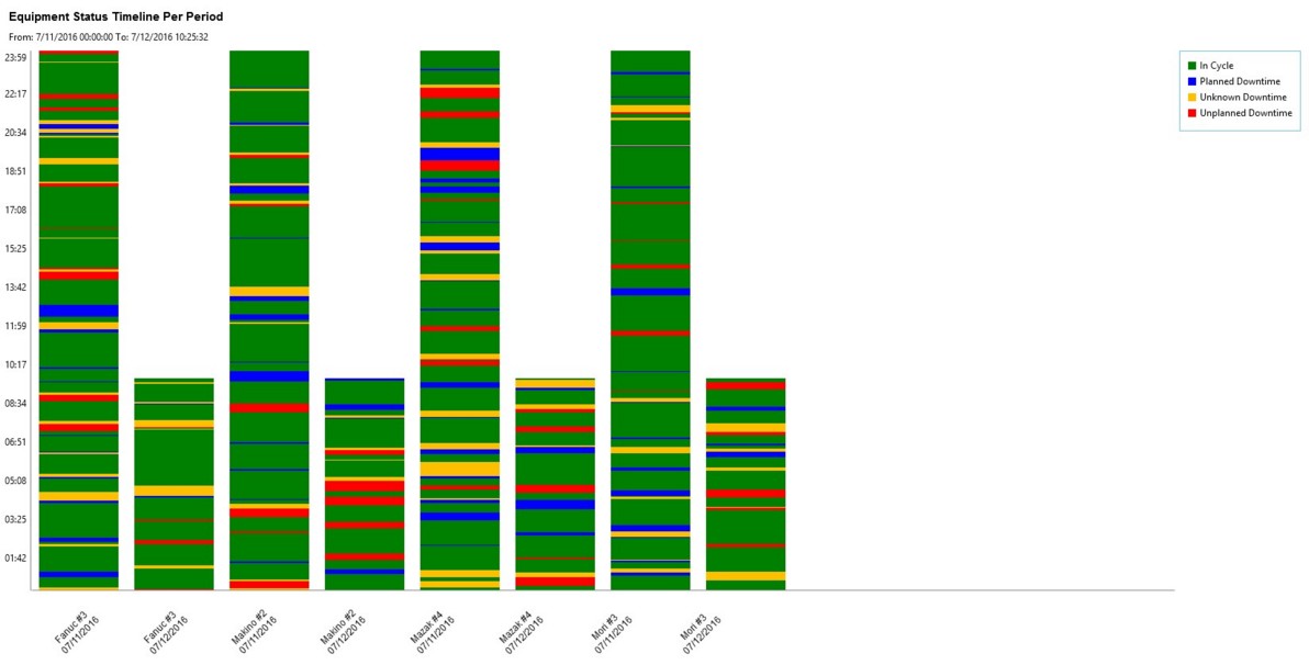
The Equipment Status Timeline Per Period chart displays a stacked bar chart on a time line showing the incremental statuses of the equipment over the time range selected. The Equipment can be selected by User Groups, Company Groups, or by the Equipment. When displaying the data from this chart it will show each machine for the timeframe that is selected so you can compare them against one another. The Equipment Status Timeline Per Period can assist further by allowing you to compare single or multiple pieces of equipment by a selectable timeframe or to detail out shifts against each other.
Required and Optional Information
A time frame and one or more pieces of equipment are required to generate the chart. By default, Last Two Days are selected for the time frame. Once the equipment has been selected the chart can be generated without specifying any additional information.
Additional filters on this page can be used to select the type of statuses to be compared and how the chart will render. By default the General status selected but you can choose specific if desired.
General and Specific Status
For the Cycle status either an individual specific status can be selected or all of the specific statuses can be selected. Selecting All Specific Statuses from the drop down menu will display each of the defined specific cycle statuses on the timeline chart.
Example of a Timeline Per Period Chart
This is an example of a Timeline Per period Chart that has three machines selected over the course of 2 days.
Once a chart is produced a magnifying glass and a percentage will appear on the top. Throughout the day a machine may have many frequent short stops. Depending on the duration of these stops some may not be rendered on this timeline. In this case the accuracy may be reduced and displayed as a percentage on the chart.
|
|