Custom Variables Histogram Chart Custom Variables Histogram Chart |   |
|
Custom Variables Histogram Chart | |
Overview
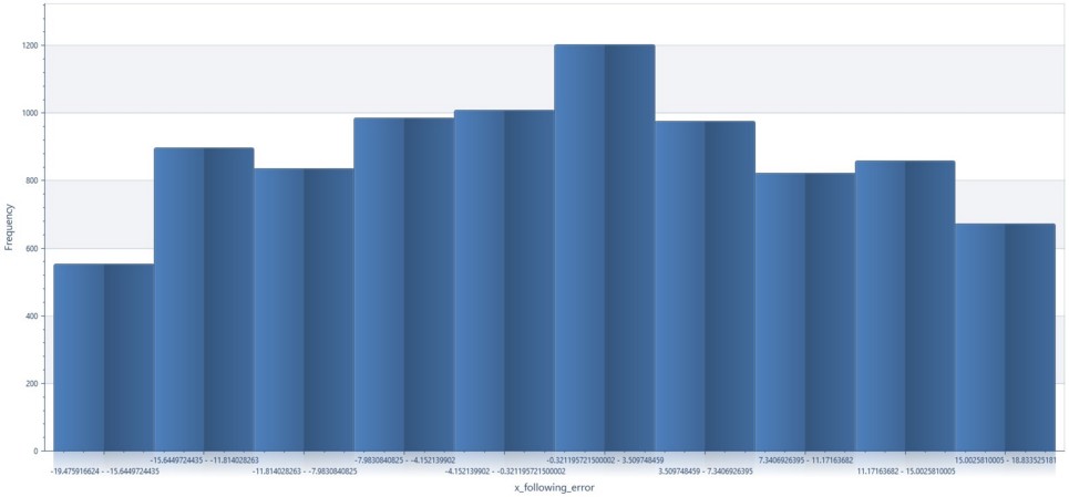
The Custom Variable Histogram Chart is a histogram is a type of graph that has wide applications in statistics. Histograms allow a visual interpretation of numerical data by indicating the number of data points that lie within a range of values, called a class or a bin. The frequency of the data that falls in each class is depicted by the use of a bar. Within DataXchange the chart displays the frequency of data captured from a custom variable. For instance, if you select more than one machine all of the data will be grouped by and broken down within the columns or 'bins' for that custom variable.
Required and Optional Information
A time frame, custom variable and one or more pieces of equipment are required to generate the chart. By default, Today is selected for the time frame. Once the equipment has been selected the Next button becomes available. After clicking the Next button you must chose a Custom Variable to plot. After a custom variable has been defined, the Finish button will be enabled.
|
Custom Variable Histogram Chart Example |
|
|